ShopDreamUp AI ArtDreamUp

Deviation Actions


Suggested Deviants


Suggested Collections


You Might Like…


Featured in Groups


Description
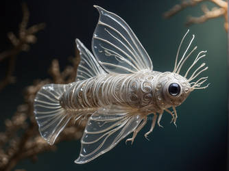
Practicing some more with body paints.
I had no inspiration so credit goes to ~traumtaenzer
for this cute little fishie
Brightened up in photoshop as the lighting was no good when I took a photo.
I had no inspiration so credit goes to ~traumtaenzer
for this cute little fishie
Brightened up in photoshop as the lighting was no good when I took a photo.
Image size
2592x3267px 4.37 MB
Make
Canon
Model
Canon EOS 400D DIGITAL
Shutter Speed
1/40 second
Aperture
F/5.6
Focal Length
45 mm
ISO Speed
400
Date Taken
May 25, 2011, 5:04:52 PM
Sensor Size
14mm
© 2011 - 2024 HelianthusMay
Comments29
Join the community to add your comment. Already a deviant? Log In
This little fish is done very well! It's a cute design. It's ball-shaped body and spherical, beady eyes, and long back fin go well together.
However, I would say the strongest aspect is the lighting. This is done very well, especially on the fish's body. Its spherical shape is really brought out - which produces a good sense of depth.
I can't write much about the specific challenges of body paint. I can say, though, the lighting of the "canvas" and the painted lighting of the fish match, which produces an interesting effect. This would be more of an effect of the photo of the work than the work itself, but it is still neat. If I look at the image at the right angle, the fish appears to pop out. If anything else, it's a testament to the quality of the shading.
As for the outlines, I feel this is one aspect that could be worked out a little better. In particular, the top fin appears blurry. I had to study the image carefully, because it could be the photo itself that is blurred. I can't rule this out completely, but nevertheless, the lack of an outline on the fin does feel a little inconsistent. The back fin has the same result, but not to the same degree. The effect is that the fish appears to blend in to the background, which in turn dampens the "popping out" effect achieved on the fish's body.
There also appears to be some cracking of the paint at the bottom of the fin. I'm not sure how to react to it, since the medium goes beyond what I've seen before. It may be worth noting, though.
Overall it's a fun image and brought out well.